Wednesday, 12 December 2012
brown paper effect
The brown paper effect
I decided to experiment with the brown paper effect with different picture such as flowers, jellyfish and books.
 |
| Combining pictures and drawings and photographs. |
 |
| My Andy Warhol attempt didn't turn out the way I wanted. So i go a new idea and decided to go with that which led me to my final book cover. |
Tuesday, 11 December 2012
Photo Shop
Starting Point
Firstly we chose the photo of a drawing we did then scanned it on to the computer to use in photo shop. When we loaded it on photo shop we used the crop tool to edit which bits we wanted and got rid of the ones we didn't want. Then we re-sized the photo. Also we used different layers and on each layer we used a different tool on each of the layers. Then I used the magic wand tool to add different colours on to the picture.
Michael Colavito
Michael Colavito
Colavito Modern Image Painting film work is created without computers, without retouching, without photo-comping, without color filters, without camera masks, without reflections, without printed images, without projected images or patterns, without darkroom manipulation or optical assembly, without painting directly on the human body or on the film itself, without blue or green screening, and without special effects editing - all on one original negative, chrome or individual frame of movie film.
Ben Slow
Ben Slow is a talented portrait artist from London. His subjects range from beautiful starlets to pop culture icons. “Working from my London studio, I find an exciting dynamic in the contradictory relationship between the glamorous pop images and the raw, unrefined urban context in which such icons are celebrated. The point of my work is to reduce the silhouette to its most elegant and minimal, while simultaneously embellishing its energy, depth and texture. The process is as symbolic as it is aesthetic,” Slow says.


Tuesday, 13 November 2012
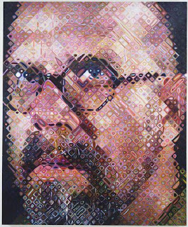
Chuck Close
I
like Chuck Close work because it looks like I photograph even though
it is a painting. After he had a seizure he was paralysed from the
neck down but he carried on painting and totally reformed his work. I like his
current work more probably because of the detail and the way he uses
the colours and how it still looks similar to a photo but I think it’s more eye
catching.
Anna Razumovskaya
Matthew Hollings
 |
| Madonna |
I like the Madonna one the most probably because of the multiple different colour which I thinks it makes it more interesting. Also I like the detail in the actual drawing as well. I like the Mick Jagger picture because of all the detail in the tone. I don't like the lack of colour in the Mick Jagger.
I like the Obama and the shark picture because it's simple and I think the shark makes it catch your eye.
Wednesday, 7 November 2012
MARCO CALCINARO
In the Audrey Hepburn portrait I like the lack of colour and the subtlety of the picture also I like the tone in the Audrey Hepburn picture. Also I like how in both of the the face is made to look more real and texture. Furthermore I like the hints of colour in the Marilyn Monroe it makes it a bit more interesting.
 z
z
Subscribe to:
Comments (Atom)


